Immagini di stile CSS
Scopri come applicare uno stile alle immagini usando i CSS.
Immagini arrotondate
Usa la border-radiusproprietà per creare immagini arrotondate:

Esempio
Immagine arrotondata:
img {
border-radius: 8px;
}
Esempio
Immagine cerchiata:
img {
border-radius: 50%;
}
Immagini in miniatura
Utilizzare la borderproprietà per creare immagini in miniatura.
Immagine in miniatura:
Esempio
img {
border: 1px solid #ddd;
border-radius: 4px;
padding: 5px;
width: 150px;
}
<img src="paris.jpg"
alt="Paris">
Immagine in miniatura come collegamento:

Esempio
img {
border: 1px solid #ddd;
border-radius: 4px;
padding: 5px;
width: 150px;
}
img:hover {
box-shadow: 0 0
2px 1px rgba(0, 140, 186, 0.5);
}
<a href="paris.jpg">
<img src="paris.jpg" alt="Paris">
</a>
Immagini reattive
Le immagini reattive si regoleranno automaticamente per adattarsi alle dimensioni dello schermo.
Ridimensiona la finestra del browser per vedere l'effetto:
Se desideri che un'immagine venga ridimensionata, se necessario, ma non ingrandisca mai per essere più grande delle sue dimensioni originali, aggiungi quanto segue:
Esempio
img {
max-width: 100%;
height:
auto;
}
Suggerimento: leggi di più sul responsive web design nel nostro tutorial CSS RWD .
Centrare un'immagine
Per centrare un'immagine, imposta i margini sinistro e destro autoe trasformala in un blockelemento:
Esempio
img {
display: block;
margin-left: auto;
margin-right: auto;
width: 50%;
}
Immagini / Schede Polaroid

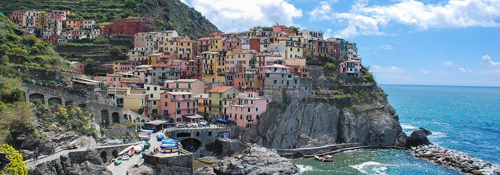
Cinque Terre

Aurora boreale
Esempio
div.polaroid {
width: 80%;
background-color: white;
box-shadow: 0 4px 8px 0 rgba(0,
0, 0, 0.2), 0 6px 20px 0 rgba(0, 0, 0, 0.19);
}
img {width: 100%}
div.container {
text-align: center;
padding: 10px 20px;
}
Immagine trasparente
La opacityproprietà può assumere un valore compreso tra 0,0 e 1,0. Più basso è il valore, più trasparente:

opacità 0,2
opacity 0.5
opacity 1
(default)
Example
img {
opacity: 0.5;
}
Image Text
How to position text in an image:
Example
Try it Yourself:
Image Filters
The CSS filter property adds visual effects (like blur and saturation) to an element.
Note: The filter property is not supported in Internet Explorer or Edge 12.
Example
Change the color of all images to black and white (100% gray):
img {
filter: grayscale(100%);
}
Tip: Go to our CSS filter Reference to learn more about CSS filters.
Image Hover Overlay
Create an overlay effect on hover:
Example
Fade in text:
Example
Fade in a box:
Example
Slide in (top):
Example
Slide in (bottom):
Example
Slide in (left):
Example
Slide in (right):
Flip an Image
Move your mouse over the image:
Example
img:hover {
transform: scaleX(-1);
}
Responsive Image Gallery
CSS can be used to create image galleries. This example use media queries to re-arrange the images on different screen sizes. Resize the browser window to see the effect:


Example
.responsive {
padding: 0 6px;
float: left;
width: 24.99999%;
}
@media only screen and
(max-width: 700px){
.responsive {
width: 49.99999%;
margin: 6px
0;
}
}
@media only screen and (max-width: 500px){
.responsive {
width: 100%;
}
}
Tip: Read more about Responsive Web Design in our CSS RWD Tutorial.
Image Modal (Advanced)
This is an example to demonstrate how CSS and JavaScript can work together.
First, use CSS to create a modal window (dialog box), and hide it by default.
Then, use a JavaScript to show the modal window and to display the image inside the modal, when a user clicks on the image:

Example
// Get the modal
var modal = document.getElementById('myModal');
// Get the image and insert it
inside the modal - use its "alt" text as a caption
var img =
document.getElementById('myImg');
var modalImg = document.getElementById("img01");
var captionText = document.getElementById("caption");
img.onclick =
function(){
modal.style.display = "block";
modalImg.src = this.src;
captionText.innerHTML = this.alt;
}
// Get the <span> element that closes the modal
var span =
document.getElementsByClassName("close")[0];
// When the user clicks
on <span> (x), close the modal
span.onclick = function() {
modal.style.display = "none";
}